We value usability highly at JotForm. That is what sets us apart from other form builders out there. We strive to put as much feature as possible in a single window so that users don't have to go through endless clicks to find stuff they need. We believe our drag and drop interface provides a central management page which directly engages with our users. At the same time, our user interface has to look simple and feel easy to use. The user interface should not look cluttered because that may put off users who feel like they are lost.
There are many other variables in the usability equation and this includes sign up pages. Sign up pages are very important because a good sign up page can increase your number of members substantially. For example, at ABtests.com there are many AB tests measuring conversion rates for different sign up pages. These reports show up to 30% increase in sign ups for easier sign up forms. It is arguably easy to understand these reports, they are not far removed from our everyday lives. Think of the last time you decided not to become a member of a web page just because you were put off by a long sign up form. I bet it was not long ago.
Designing Sign Up Forms
At JotForm we don't present a registration page to our users before they can use our product. When someone comes to our homepage, they can start using our form builder immediately and create their forms. Many of the features we call advanced are available to use without requiring becoming a member, let alone becoming a paying one. We believe one should be able to test most if not all of the features before finding it worth their use and ultimately paying for it. In line with our thoughts on registration, we strived to build a simple sign up form.

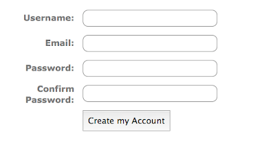
You can see a screenshot of the sign up form which will be live with the new version of JotForm to be released before the end of this year. The first thing to note is being short and concise. We only ask information that is really important from our users: username, email and password. Other information like full name, time zone, website etc. are not as important and they could be filled at a later time from account information pages. Even password confirmation box could be removed here because most of the users will type what they intend, we are penalizing say 99% of our users who type correctly by making them type their passwords again. For the other ~1% of users who type wrong, they could simply request resetting their passwords via their email address.
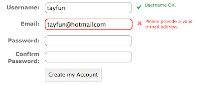
Going forward, we implemented a live feedback for usernames:

While you are still typing your desired username, JavaScript on the background checks the server to see if the username is available. This is nice in that you can easily see which options are available to you. So you can choose that nice username you have wanted for so long.
The other improvement to note is the live feedback on other fields like email. We wouldn't want to do a round trip to the server just to see that we have mistyped our email address, would we?

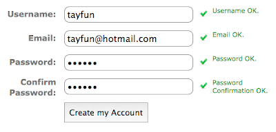
And of course not everything is wrong in a form. Confirming that the form is correct can give encouragement and assurance to the user.

This concludes looking at the design of the form. For those who are interested in the background technical stuff, I do have a few ideas that became relevant while development.
Technical Stuff
I always like going into the technical tidbits and finding gems out there, elegant solutions. For my first iteration of the form, username availability check was done for every letter typed. So if someone is typing their desired username continuously that would mean a lot of requests to the server. I changed this so that there is a counting semaphore like single variable that keeps track of how many requests are pending (note that JavaScript is single threaded). If there are more than one request pending, only the last one gets to check the server. The time interval to see if there are other keystrokes is 500 msec for the following example:
function checkKeypress(event) {
... // other stuff
   newKeyPress++;
   setTimeout(checkAvailibility, 500); // Wait half a sec.
}

function checkAvailibility(event) {
   newKeyPress--;
   if (newKeyPress != 0) {
      // There's a newer event out there. Let him handle this.
      return;
    }
    ... // other stuff
}
The next improvement I made was a similar one, but regarding images. I was adding a class name to a div so that the spinning image denoting that something was being done in the background would be shown in the page. Every time I added "loading" to the class name, the browser went to the server and asked the image. Even though the browser replied with a 304- Not Changed, this was still not the right way to do it. I changed the code so that both "loading" div and "error" div etc. are on the page always, just not shown. I used the "display" property to hide and show the divs and the browser seemed much more relaxed this way. No sweat.
The final improvement was made by transferring view logic from JavaScript to CSS. I was initially changing the display property of each div individually by javascript, but that meant a lot of code. Since this is all about the view, it also doesn't make sense to use JavaScript this way. Sure adding a class name is OK but doing inline styles was ugly. I was talking to Seyhun about this and he suggested using a bit more complex CSS rules to achieve the same effect without using a single line of JavaScript. So now I have these kinds of CSS rules:
div.error > div.errorMessage,
div.correct > div.correctMessage,
div.neutral > div.neutralMessage {
    display: inline;
}

div.error > div.correctMessage,
div.error > div.neutralMessage,
div.correct > div.errorMessage,
div.correct > div.neutralMessage,
div.neutral > div.errorMessage,
div.neutral > div.correctMessage {
    display: none;
}
It is making the CSS file more bloated but more concise JavaScript is the way to go. It is now easily understandable, maintainable and much more efficient.
Further Reading
[1] Smashing Magazine has a two post series on web forms and sign up forms in general: First post and the second one.
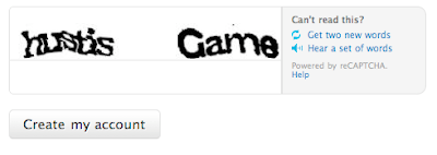
[2] Examining how other big websites do their forms is a good way to learn. Yahoo, Google, StackOverflow and Twitter are good options. I especially like twitter, they have subtle differences that make a huge difference. Take their Capthca for example:

It is a simple reCaptcha implementation, right? Not quite, see what happens if you have an error in your form when you submit and your form is shown to you again:

Yep, if you have typed the captcha right the first time you won't need to type it again if you have forgotten something else on the form. Nice isn't it?
